Brasserie Blanc
Chez Nous; an authentic, warm and welcoming environment – an evolution of the home.
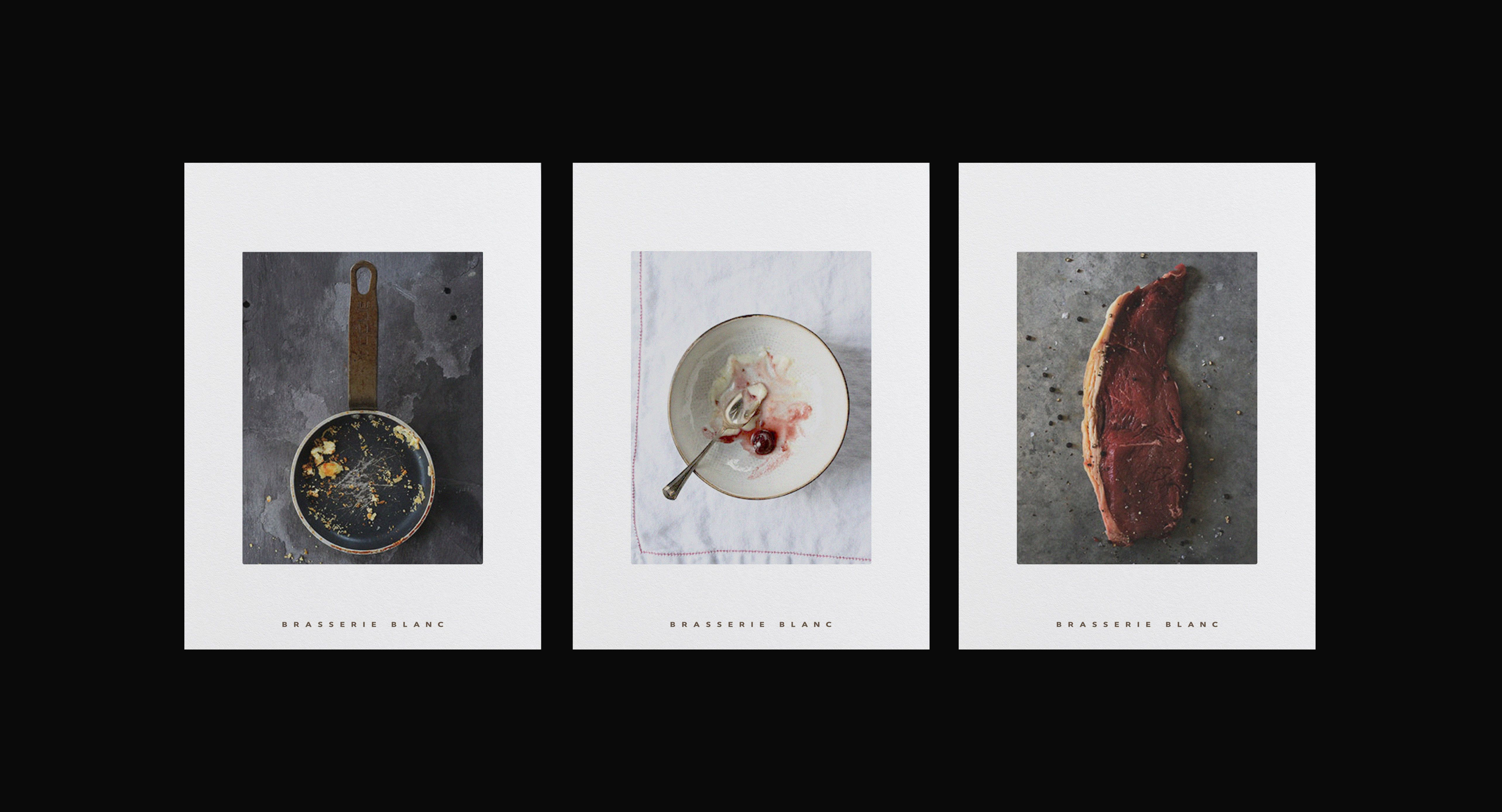
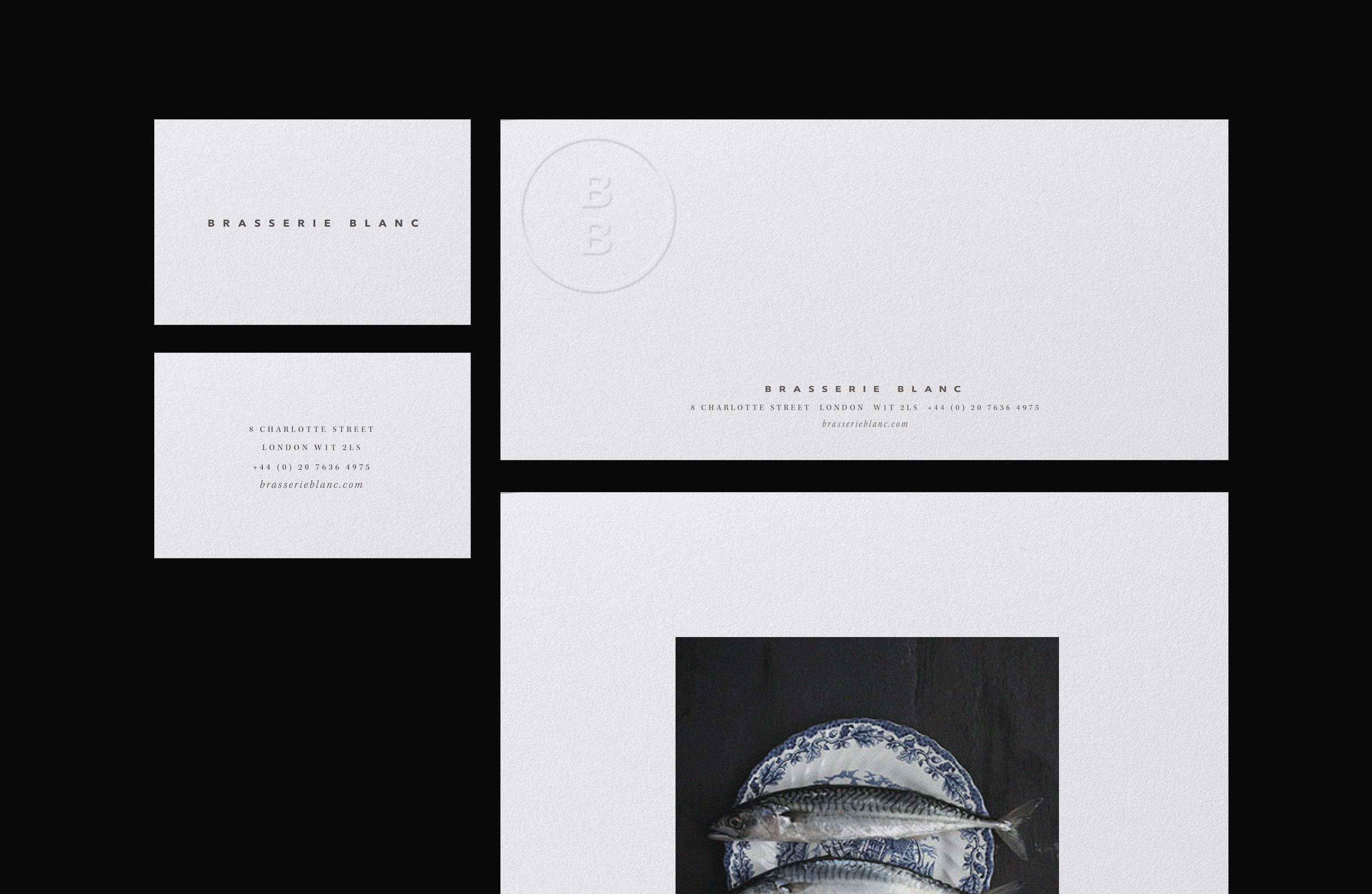
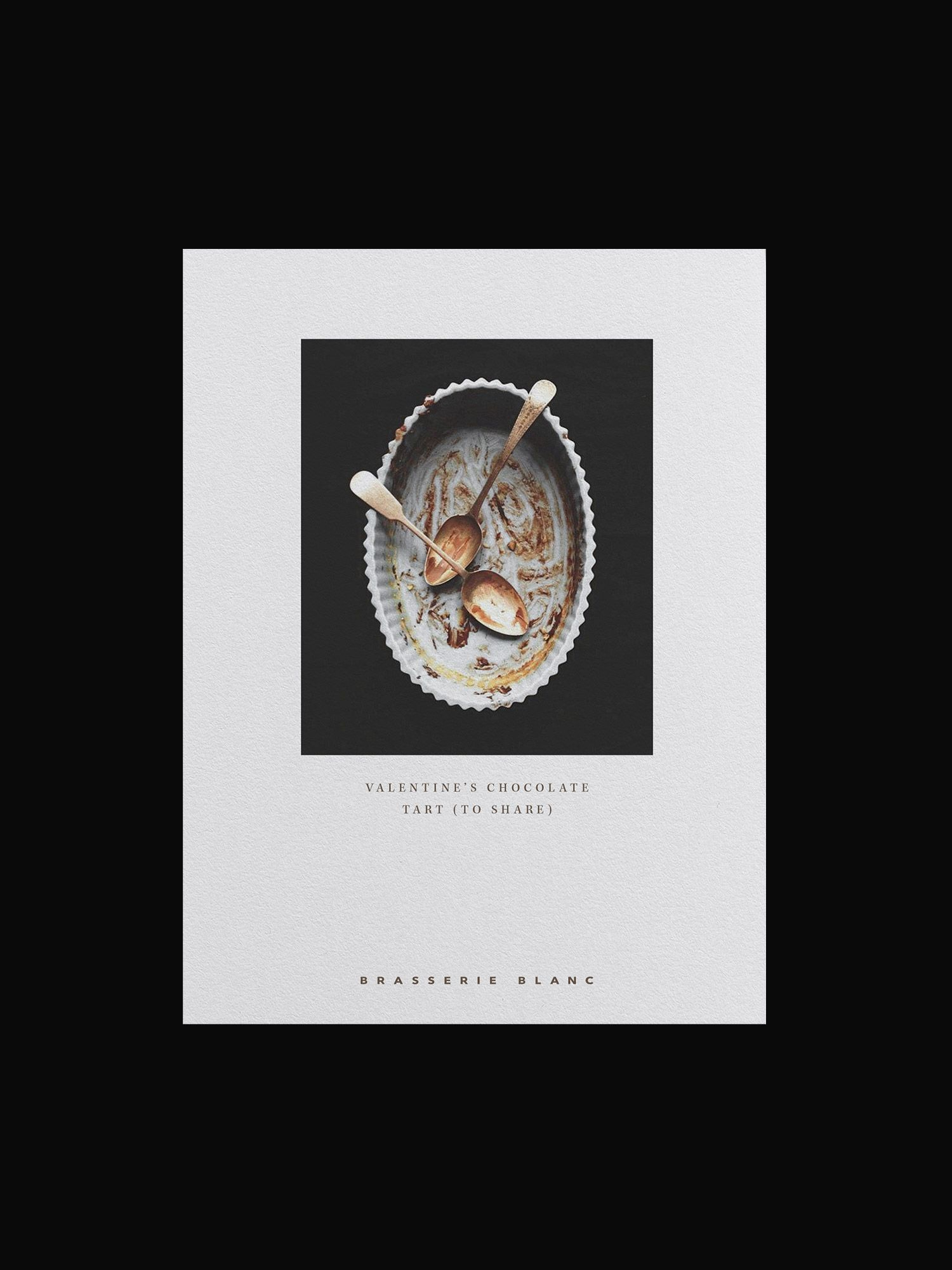
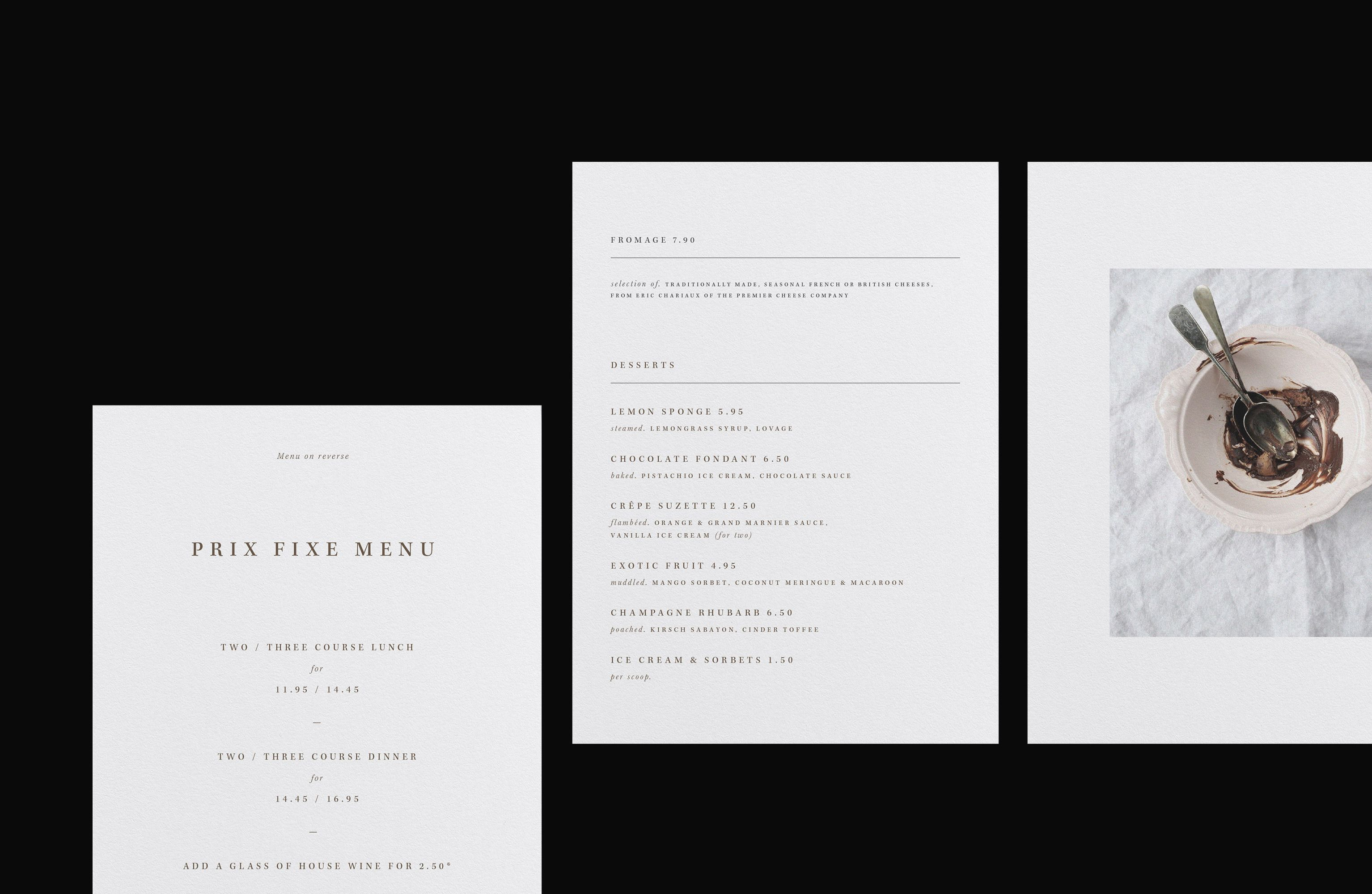
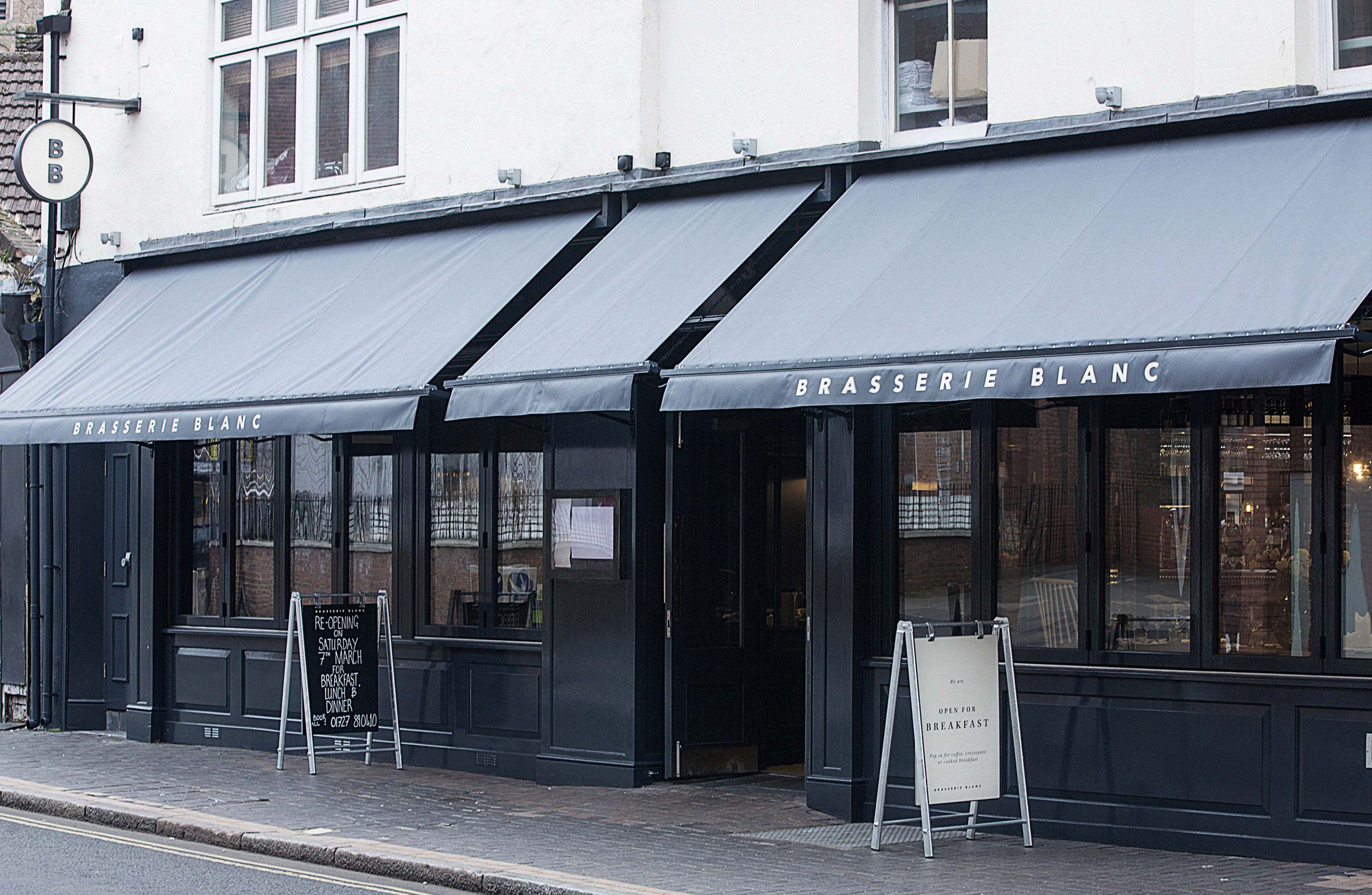
The brand refresh of Brasserie Blanc intertwines the narrative of ‘Chez Nous’ with provenance and community, celebrating the sentiment of authentic French cooking, from the heart. The brand mark is updated into a simple san-serif typeface, elevating the brand into a more contemporary setting. Alongside the primary brand mark, the creation of a secondary brand mark, the BB roundel, further enriches Brasserie Blanc’s visual dialogue with its environment and is an integral addition to the brand’s identity. The BB roundel is seen as a stamp of approval and a memorable sign-off for the brand. It is used subtly in various brand collateral and becomes an intrinsic element of the signage system. Authenticity and warmth are considered key attributes when designing Brasserie Blanc’s large array of printed collateral. This tone is conveyed through the simplicity of composition and construction, unravelling a confident yet restrained beauty. A language structure has been specifically developed for Brasserie Blanc, to preserve the integrity of the brand’s tone of voice.